8 Using Pandas to Explore Data
In this chapter we will use the package pandas to do some exploratory plots on a dataset containing Gender, Height and, Weight. The dataset is an edited version from Kaggle where we trimmed to 200 total rows and converted everything to the metric system.
8.1 Barcharts
Example 1 Barcharts with error bars
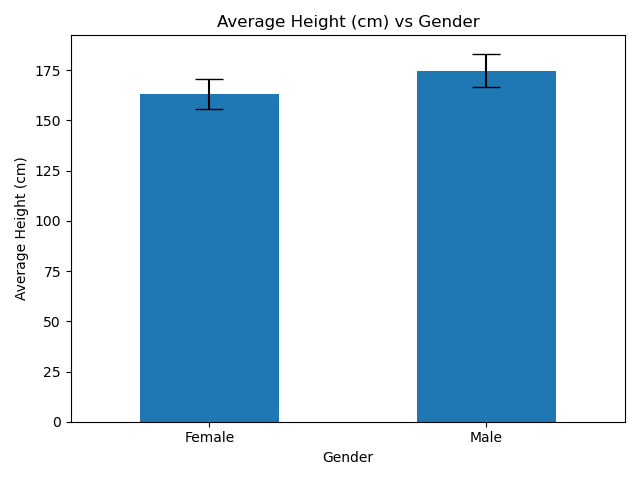
Things to take note
- Loading in the dataset from https://raw.githubusercontent.com/nus-sps/workshops.tfi.data-visualisation/main/files/height-weight-metric.csv
- Standard Deviation and Mean are calculated using numpy.
- Usage of
groupby,.aggandyerr.
Example
import pandas as pd
import matplotlib.pyplot as plt
import numpy as np

# Reading in the dataset as df
link = 'https://raw.githubusercontent.com/nus-sps/workshops.tfi.data-visualisation/main/files/height-weight-metric.csv'
df = pd.read_csv(link)

df_height_grouped = df.groupby("Gender")['Height']


df_height_mean_se_gender = df_height_grouped.agg([np.mean, np.std])
df_height_mean_se_gender.plot(kind = 'bar', yerr = 'std',capsize=10, rot=0,legend=False)

plt.ylabel('Average Height (cm)')
plt.xlabel('Gender')
plt.title('Average Height (cm) vs Gender')
plt.tight_layout()
plt.show()
8.2 Histograms
Example 2 Histograms with Grouping
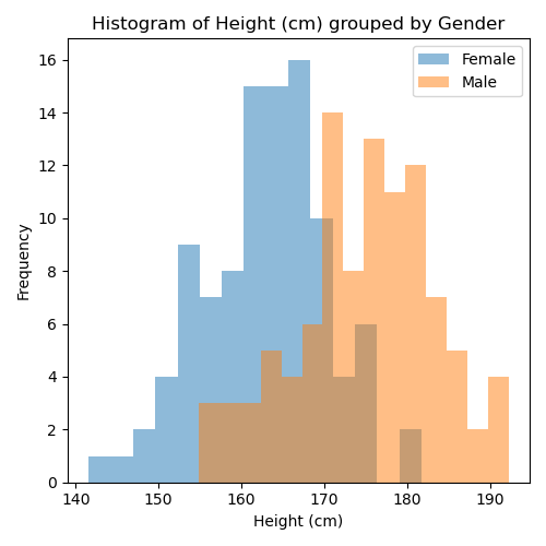
Things to take note
- Loading in the dataset from https://raw.githubusercontent.com/nus-sps/workshops.tfi.data-visualisation/main/files/height-weight-metric.csv
- Usage of
.groupbyto group in histograms
Example (No Grouping)
import pandas as pd
import matplotlib.pyplot as plt
import numpy as np

# Reading in the dataset as df
link = 'https://raw.githubusercontent.com/nus-sps/workshops.tfi.data-visualisation/main/files/height-weight-metric.csv'
df = pd.read_csv(link)


df['Height'].plot(kind='hist')

# Label your axis
plt.ylabel('Frequency', fontsize = 10)
plt.xlabel('Height (cm)', fontsize = 10)
plt.title('Histogram of Height (cm)', fontsize = 20)
plt.tight_layout()
plt.legend()
plt.show()
Example (Grouped)
import pandas as pd
import matplotlib.pyplot as plt
import numpy as np

# Reading in the dataset as df
link = 'https://raw.githubusercontent.com/nus-sps/workshops.tfi.data-visualisation/main/files/height-weight-metric.csv'
df = pd.read_csv(link)


grouped_gender = df.groupby("Gender")['Height']
grouped_gender.plot(kind='hist', alpha = 0.5, bins = 15)

# Label your axis
plt.ylabel('Frequency')
plt.xlabel('Height (cm)')
plt.title('Histogram of Height (cm) grouped by Gender')
plt.tight_layout()
plt.legend()
plt.show()
8.3 Scatterplots
Example 3 Grouped Scatterplots
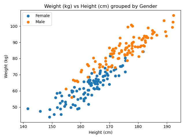
Things to take note
- Loading in the dataset from https://raw.githubusercontent.com/nus-sps/workshops.tfi.data-visualisation/main/files/height-weight-metric.csv
Example (No Grouping)
import pandas as pd
import matplotlib.pyplot as plt

# Reading in the dataset as df
link = 'https://raw.githubusercontent.com/nus-sps/workshops.tfi.data-visualisation/main/files/height-weight-metric.csv'
df = pd.read_csv(link)


df.plot("Height", 'Weight', kind='scatter')

# Label your axis
plt.xlabel('Height (cm)')
plt.ylabel('Weight (kg)')
plt.title('Weight (kg) vs Height (cm)')
plt.tight_layout()
plt.legend()
plt.show()
Example (Grouped)
import pandas as pd
import matplotlib.pyplot as plt

# Reading in the dataset as df
link = 'https://raw.githubusercontent.com/nus-sps/workshops.tfi.data-visualisation/main/files/height-weight-metric.csv'
df = pd.read_csv(link)


df_grouped_gender = df.groupby("Gender")

fig, ax = plt.subplots()

for name, gender in df_grouped_gender:
    ax.scatter(gender["Height"], gender["Weight"], label=name)

# Label your axis
plt.xlabel('Height (cm)')
plt.ylabel('Weight (kg)')
plt.title('Weight (kg) vs Height (cm) grouped by Gender')
plt.tight_layout()
plt.legend()
plt.show()
8.4 Boxplots
Example 4 Boxplots
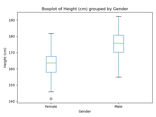
Things to take note
- Loading in the dataset from https://raw.githubusercontent.com/nus-sps/workshops.tfi.data-visualisation/main/files/height-weight-metric.csv
- Note the use of
df.boxplotfor boxplot instead ofdf.plot. - For our purposes
plt.suptitle('')was used to remove the secondary title of our boxplot.
Example
import pandas as pd
import matplotlib.pyplot as plt

# Reading in the dataset as df
link = 'https://raw.githubusercontent.com/nus-sps/workshops.tfi.data-visualisation/main/files/height-weight-metric.csv'
df = pd.read_csv(link)


#Plotting boxplot
ax = df.boxplot('Height', by='Gender')
ax.grid(False)

# Don't forget to add the labels for clarity!
plt.suptitle('')
plt.title('Boxplot of Height (cm) grouped by Gender')
plt.ylabel('Height (cm)')
plt.xlabel('Gender')
plt.tight_layout()
plt.show()