10 Using Pandas to Explore COVID-19 Data
10.1 Plans for this section
In the previous two sections, we introduced basics to plotting using matplotlib and generating exploratory analysis & visualisations using pandas. In this section, we are going to put these skills into practice and explore the COVID19 dataset from GitHub (https://github.com/datasets/covid-19) that is maintained by Johns Hopkins University.
10.2 Housekeeping
It is always good to get a rough idea about a dataset, right at the start.
Exercise 1 What are we dealing with?
Result
| Confirmed | Recovered | Deaths | |
|---|---|---|---|
| count | 1.142700e+05 | 1.142700e+05 | 114270.000000 |
| mean | 3.832402e+05 | 2.055785e+05 | 8941.022079 |
| std | 2.057547e+06 | 1.153802e+06 | 40707.331433 |
| min | 0.000000e+00 | 0.000000e+00 | 0.000000 |
| 25% | 4.410000e+02 | 2.600000e+01 | 6.000000 |
| 50% | 9.767000e+03 | 3.811000e+03 | 155.000000 |
| 75% | 1.213500e+05 | 6.130400e+04 | 2185.000000 |
| max | 3.879675e+07 | 3.097475e+07 | 637531.000000 |
| Date | Country | Confirmed | Recovered | Deaths | |
|---|---|---|---|---|---|
| 0 | 2020-01-22 | Afghanistan | 0 | 0 | 0 |
| 1 | 2020-01-23 | Afghanistan | 0 | 0 | 0 |
| 2 | 2020-01-24 | Afghanistan | 0 | 0 | 0 |
| 3 | 2020-01-25 | Afghanistan | 0 | 0 | 0 |
| 4 | 2020-01-26 | Afghanistan | 0 | 0 | 0 |
Tasks
The dataframe is huge with many countries!
Load the data from https://raw.githubusercontent.com/datasets/covid-19/main/data/countries-aggregated.csv
What is the shape of the data? I.e. how many rows and columns are there?
Are there any missing numbers?
What are column names?
Exercise 2 Drop those unnecessary columns?
Result
| Date | Country | Confirmed | Deaths | |
|---|---|---|---|---|
| 0 | 2020-01-22 | Afghanistan | 0 | 0 |
| 1 | 2020-01-23 | Afghanistan | 0 | 0 |
| 2 | 2020-01-24 | Afghanistan | 0 | 0 |
| 3 | 2020-01-25 | Afghanistan | 0 | 0 |
| 4 | 2020-01-26 | Afghanistan | 0 | 0 |
Exercise 3 Subset to ASEAN countries only
Result
| Date | Country | Confirmed | Recovered | Deaths | |
|---|---|---|---|---|---|
| 14064 | 2020-01-22 | Brunei | 0 | 0 | 0 |
| 14065 | 2020-01-23 | Brunei | 0 | 0 | 0 |
| 14066 | 2020-01-24 | Brunei | 0 | 0 | 0 |
| 14067 | 2020-01-25 | Brunei | 0 | 0 | 0 |
| 14068 | 2020-01-26 | Brunei | 0 | 0 | 0 |
Tasks
The dataframe is huge with many countries!
-
Find a way to subset the dataframe to only contain ASEAN countries. Here is a list of the ASEAN countries.
ASEAN_countries_list = [
'Brunei', 'Burma', 'Cambodia',
'Indonesia', 'Laos', 'Malaysia',
'Philippines', 'Singapore', 'Vietnam']
Solution
ASEAN_countries = [
    'Brunei', 'Burma', 'Cambodia',
    'Indonesia', 'Laos', 'Malaysia',
    'Philippines', 'Singapore', 'Vietnam'
]

# Where are the rows with the ASEAN countries?
filtered_ASEAN_rows = df_all['Country'].isin(ASEAN_countries)

# Select the ASEAN rows
df_ASEAN = df_all[filtered_ASEAN_rows]
df_ASEAN.head()
10.3 Exploration of COVID19 dataset: Bar Chart
Exercise 4 Plotting the Total Deaths in each country
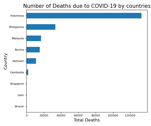
Tasks
Subset the dataset so that it contains only the latest date of each country.
Using either
pandasormatplotlibor both, plot the total number of deaths in each country.Is there a better way to represent this plot? Hint: Maybe make the barchart descending!
Solution
# Pandas Manipulation #
latest_date = max(df_ASEAN['Date'])
df_ASEAN_latest_date = df_ASEAN[df_ASEAN['Date'] == latest_date]
df_ASEAN_latest_date.set_index('Country', inplace=True)
df_ASEAN_latest_date.sort_values(by='Deaths', ascending=True, inplace=True)

# Plotting #
ax = df_ASEAN_latest_date['Deaths'].plot(kind='barh')

# Pretty Things #
ax.set_xlabel('Total Deaths', fontsize=12)
ax.set_ylabel('Country', fontsize=12)
ax.set_title('Number of Deaths due to COVID-19 by countries', fontsize=15)
plt.xticks(fontsize=8)
plt.yticks(fontsize=8)
plt.tight_layout()
plt.show()
10.4 Exploration of COVID19 dataset: Time-Series
Exercise 5 Total Confirmed Cases in each country over time
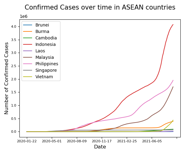
Tasks
Using the dataframe containing ALL DATES of ASEAN countries only:
Plot the total number of confirmed cases against dates.
Ensure that each country has their own
colour.Enable the legend
Solution
# Plotting #
fig, ax = plt.subplots(figsize=(6, 5))

# Iterate through our countries so we can plot automatically plot them!
for country in ASEAN_countries:
    df_ASEAN_perCountry = df_ASEAN[df_ASEAN['Country'] == country]
    df_ASEAN_perCountry.plot('Date','Confirmed',ax=ax, label = country)

# Pretty Things #
plt.legend()
plt.ylabel('Number of Confirmed Cases', fontsize = 12)
plt.xlabel('Date', fontsize = 12)
plt.title('Confirmed Cases over time in ASEAN countries\n', fontsize = 15)
plt.xticks(fontsize = 8)
plt.yticks(fontsize = 8)
plt.tight_layout()
plt.show()
10.5 Exploration of COVID19 dataset: Time-Series Daily Cases
Exercise 6 Daily Confirmed Cases in each country over time
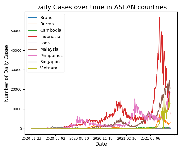
Tasks
Using the dataframe containing ALL DATES of ASEAN countries only:
Find the daily cases for each country using
.diff().Set all negative values to NaN or 0s.
Plot the daily number of confirmed cases against dates.
Ensure that each country has their own
colour.Enable the legend
Solution
import numpy as np

# Pandas Manipulation #

df_ASEAN.loc[:, 'Daily'] = df_ASEAN['Confirmed'].diff()
df_ASEAN[df_ASEAN['Daily'] < 0] = np.NaN

# Plotting #
fig, ax = plt.subplots(figsize=(6, 5))

# Iterate through our countries so we can plot automatically plot them!
for country in ASEAN_countries:
    df_ASEAN_perCountry = df_ASEAN[df_ASEAN['Country'] == country]
    df_ASEAN_perCountry.plot('Date','Daily',ax=ax, label = country)

# Pretty Things #
plt.legend()
plt.ylabel('Number of Daily Cases', fontsize = 12)
plt.xlabel('Date', fontsize = 12)
plt.title('Daily Cases over time in ASEAN countries', fontsize = 15)
plt.xticks(fontsize = 8)
plt.yticks(fontsize = 8)
plt.tight_layout()
plt.show()