9 Using Pandas to Explore Data Exercises
In this chapter you will use the package pandas to do some exploratory plots on a dataset containing Gender, Preparation.course.completion and, various test scores. The dataset is an edited version from Kaggle where we trimmed to 200 total rows and reduced some columns.
Imagine you are a teacher and want to investigate the effectiveness of a test preparation course you have developed (test.preparation.course). You have randomly selected 200 students to either take this course or to not take the course. Their scores have also been recorded.
The overall task is for you to see if taking the test preparation course would help in the various tests.
You are also tasked to find out any correlations between math.score, reading.score and writing.score.
9.1 Housekeeping
Exercise 1 What are we dealing with
Result
| gender | lunch | test.preparation.course | math.score | reading.score | writing.score | |
|---|---|---|---|---|---|---|
| 0 | male | standard | none | 72 | 68 | 67 |
| 1 | male | free/reduced | none | 68 | 68 | 61 |
| 2 | female | free/reduced | none | 65 | 86 | 80 |
| 3 | female | standard | completed | 86 | 85 | 91 |
| 4 | female | free/reduced | none | 74 | 74 | 72 |
| test.preparation.course | math.score | reading.score | writing.score | |
|---|---|---|---|---|
| 0 | none | 72 | 68 | 67 |
| 1 | none | 68 | 68 | 61 |
| 2 | none | 65 | 86 | 80 |
| 3 | completed | 86 | 85 | 91 |
| 4 | none | 74 | 74 | 72 |
Tasks
- Loading in the dataset from https://raw.githubusercontent.com/nus-sps/workshops.tfi.data-visualisation/darren-branch/files/StudentPerformance2.csv
- What is the shape of the data? I.e how many rows and columns are there?
- What does the dataframe look like?
- Drop unnecessary columns that might not affect test scores
9.2 Boxplots
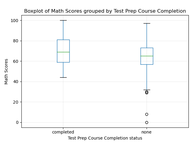
Exercise 2 Boxplots for the two groups
Tasks
With your new dataframe:
Plot a boxplot of the test scores of
math.scoreSeparate the boxplot into two groups of students that have taken the test preparation course and those who haven’t.
Label the axis properly
Solution
import matplotlib.pyplot as plt


#Plotting boxplot
ax = df_dropped.boxplot('math.score', by='test.preparation.course')
ax.grid(alpha = 0.25)

# Don't forget to add the labels for clarity!
plt.suptitle('')
plt.title('Boxplot of Math Scores grouped by Test Prep Course Completion')
plt.ylabel('Math Scores')
plt.xlabel('Test Prep Course Completion status')
plt.tight_layout()
plt.show()
Interpreting the results
It seems that completing the test preperatiion course helped only a little bit in increasing math scores.
You can see this by the differing means. But the difference is very small.
Maybe the test preparation course might not be working as effectively as we thought!
More statistical testing needs to be done (a simple t-test might be suitable)
You can try to familiarise yourself by changing the code so as to plot the different test scores!
9.3 Scatterplot
Now that you know that the test preparation course does not really help students increase their scores.
Maybe it is possible to help someone on another test depending on how they are doing with the other tests.
Exercise 3 Scatterplot

Solution
# Init subplots
fig, ax = plt.subplots(ncols = 3, figsize = (10,5))

# Plotting Reading Score vs Writing
df_dropped.plot("reading.score", "writing.score", kind = 'scatter', ax = ax[0])
ax[0].set_xlabel('reading score')
ax[0].set_ylabel('writing score')
ax[0].set_title('writing vs reading')

df_dropped.plot("reading.score", "math.score", kind = 'scatter', ax = ax[1])
ax[1].set_xlabel('reading score')
ax[1].set_ylabel('math score')
ax[1].set_title('math vs reading')

df_dropped.plot("writing.score", "math.score", kind = 'scatter', ax = ax[2])
ax[2].set_xlabel('writing score')
ax[2].set_ylabel('math score')
ax[2].set_title('math vs writing')

# Don't forget to add the labels for clarity!
plt.tight_layout()
plt.show()
Interpreting the results
It seems if a student is struggling with any test, they are bound to struggle for the other tests as well!
Great! It seems that maybe you could (as a teacher) step in to give students extra guidance if they did not score that well for one test!
Just remember! This is all ASSOCIATION and not CAUSATION. It just so happens that in these students, if they tend to score badly for one test, they will score badly for the other tests!
With these information in mind, you are able to perhaps change the test preparation course materials to better help your students!
You are also able to identify at-risk students straight away from just one test, and could possibly help them score better for their other 2 tests!