6 Basic Plotting with matplotlib
)](https://matplotlib.org/3.1.1/_images/sphx_glr_anatomy_001.png)
Figure 6.1: The various parts of a matplotlib figure. (From matplotlib.org)
6.1 Some Simple Plots
Example 1 A Simple Plot
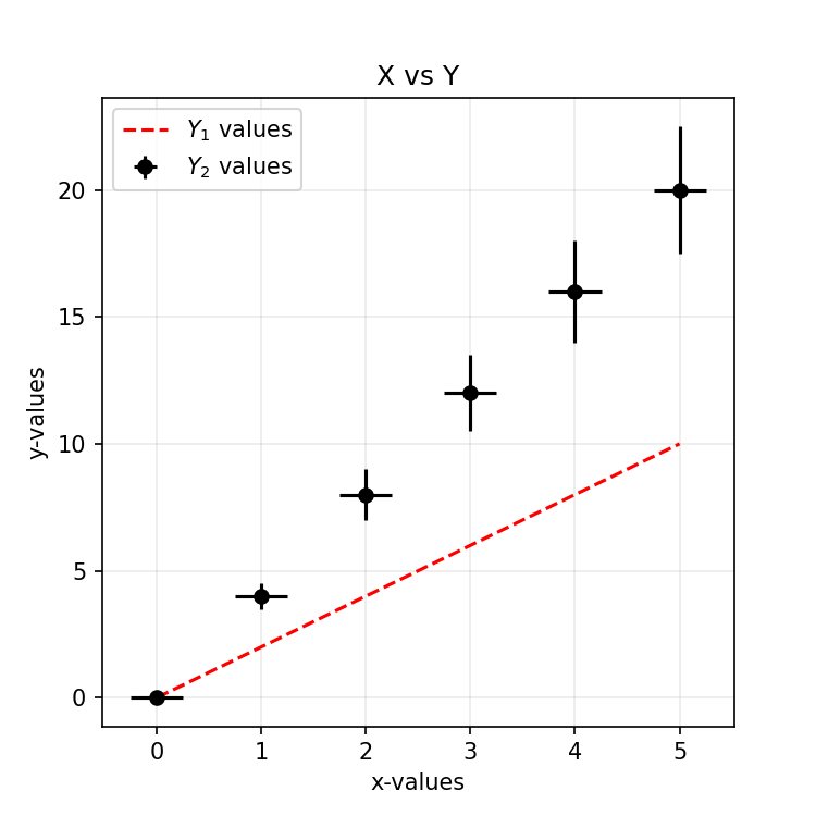
Code
- You can have only a
scatter(without error bars) by using scatter (which is commented below). -
fmtis short for ‘format string.’ This decides the shape of the data point. - The $…$ allows us to use (a limited set of) LaTeX commands!
from matplotlib import pyplot as plt

# Some data for plotting
x = [0, 1, 2, 3, 4, 5]
y_1 = [0, 2, 4, 6, 8, 10]
y_2 = [0, 4, 8, 12, 16, 20]
err = [0.0, 0.5, 1.0, 1.5, 2.0, 2.5]

# Lets start plotting
fig, ax = plt.subplots(nrows=1, ncols=1, figsize=(5, 5))
ax.plot(x, y_1, color='red', linestyle='dashed', label='$Y_1$ values')
ax.errorbar(x, y_2, yerr=err, xerr=.25, color='black', fmt='o', label='$Y_2$ values')
# ax.scatter(x, y_2, color='blue', label='$Y_2$ values')

ax.set_xlabel('x-values')
ax.set_ylabel('y-values')
ax.set_title('X vs Y')
ax.grid(alpha=.25)
ax.legend(loc='upper left')
plt.show()
Exercise 1 A Simple Plot
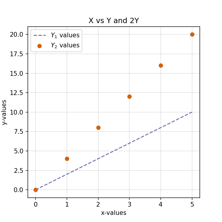
Tasks
Reproduce the plot of Example 1 in Colab by copying and pasting the code.
Comment the
errorbarplot to and un-comment thescatterplot.Visit colorbrewer2.org and select two qualitative colour that is colourblind friendly and print friendly.
-
Change the following properties of the plot.
- Change colour of the line to your first colour.
- Change colour of the scatter to your second colour.
- Change the title to ‘X vs. Y and 2Y’
Change the colour of the grid to gray.
Change the format of the saved figure to PDF.
-
Download the saved plot into your computer.
Please spend not more that 5 minutes on this exercise.
A Solution
from matplotlib import pyplot as plt

# Some data for plotting
x = [0, 1, 2, 3, 4, 5]
y_1 = [0, 2, 4, 6, 8, 10]
y_2 = [0, 4, 8, 12, 16, 20]
err = [0.0, 0.5, 1.0, 1.5, 2.0, 2.5]

# Lets start plotting
fig, ax = plt.subplots(nrows=1, ncols=1, figsize=(5, 5))
ax.plot(x, y_1, color='#7570b3', linestyle='dashed', label='$Y_1$ values')
ax.scatter(x, y_2, color='#d95f02', label='$Y_2$ values')

ax.set_xlabel('x-values')
ax.set_ylabel('y-values')
ax.set_title('X vs Y and 2Y')
ax.grid(alpha=.25, color='gray')
ax.legend(loc='upper left')

plt.savefig('simple-01.png', dpi=150)
plt.show()
Example 2 Another Way to Plot
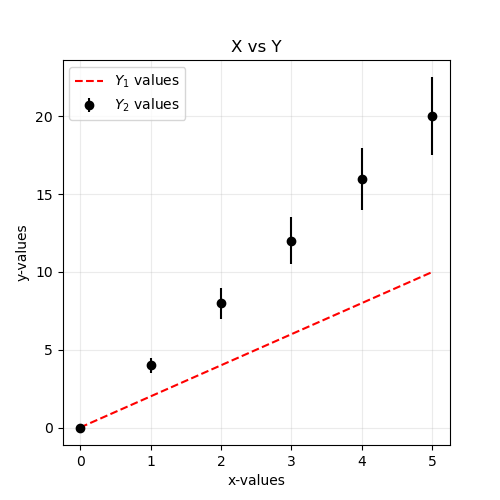
Code
-
matplotliballows several syntaxes. One is referred to as the pyplot API. It is simple but can be limited. -The version we are using is referred to as the object-oriented API. It is slightly complicated but offers more flexibility and versatility than the pyplot API. - Just for comparison, here is the code using pyplot API format
from matplotlib import pyplot as plt

# Some data for plotting
x = [0, 1, 2, 3, 4, 5]
y_1 = [0, 2, 4, 6, 8, 10]
y_2 = [0, 4, 8, 12, 16, 20]
err = [0.0, 0.5, 1.0, 1.5, 2.0, 2.5]

# Lets start plotting
plt.figure(figsize=(5, 5))
plt.plot(x, y_1, color='red', linestyle='dashed', label='$Y_1$ values')
plt.errorbar(x, y_2, yerr=err, color='black', fmt='o', label='$Y_2$ values')

plt.xlabel('x-values')
plt.ylabel('y-values')
plt.title('X vs Y')
plt.grid(alpha=.25)
plt.legend(loc='upper left')
plt.show()
Example 3 Plotting and Filling

Code
In this plot:
- We generated sine and cosine graphs.
- We plotted a \(y = 0\) line.
- Filled in the spaces where \(\cos x > \sin x\) with orange.
- Filled in the spaces where \(\sin x > \cos x\) with blue.
import numpy as np
from matplotlib import pyplot as plt

# Generating data
x = np.linspace(-np.pi, np.pi, num=100, endpoint=True)
cos_x = np.cos(x)
sin_x = np.sin(x)

# Plotting
fig, axes = plt.subplots()
axes.plot(x, sin_x, label='sin x')
axes.plot(x, cos_x, label='cos x')
axes.hlines(0, xmin = -np.pi, xmax = np.pi, linestyle = 'dashed')

# Filling
axes.fill_between(x, cos_x, sin_x, where=cos_x > sin_x,
                  color='orange', alpha=.125, label='cos x > sin x')

axes.fill_between(x, cos_x, sin_x, where=cos_x < sin_x,
                  color='b', alpha=.075, label='cos x < sin x')

# Aesthetics
axes.set_xticks([-np.pi, -np.pi/2, 0, np.pi/2, np.pi]),
axes.set_xticklabels([r'$-\pi$', r'$-\pi/2$', r'$0$', r'$+\pi/2$', r'$+\pi$'])

axes.legend()
axes.grid(axis='x', alpha=.5)

plt.tight_layout()
plt.show()
6.2 Multiple Plots
Example 4 A Column of Axes
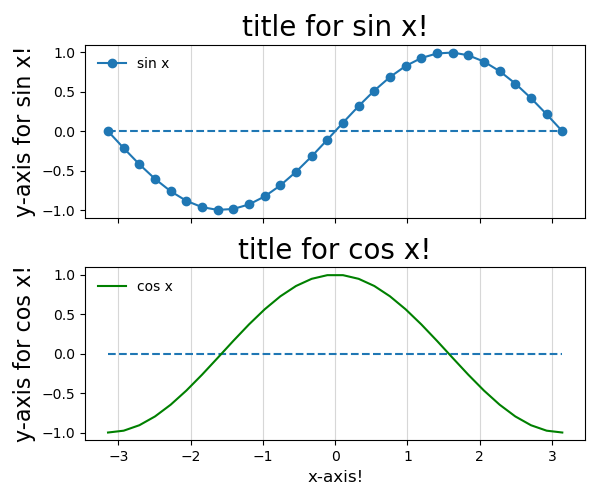
Code
- We generate two sets of data sin x and cos x
- We want to plot these two graphs side by side but do not want them to be on the same figure!
- This is done using the
plt.subplots()argument. -
plt.subplots()also hasncols =to specify the number of columns!
from matplotlib import pyplot as plt
import numpy as np

# Generating data via numpy package
x = np.linspace(-np.pi, np.pi, num=30, endpoint=True)
cos_x = np.cos(x)
sin_x = np.sin(x)


# Specify how many columns or rows
fig, ax = plt.subplots(nrows = 2, figsize=(6, 5), sharex = True)

ax[1].set_xlabel('x-axis!', fontsize = 12)

# Aesthetics & Plotting for ax[0] #
ax[0].plot(x, sin_x, marker = 'o', linestyle = '-' ,label='sin x')
ax[0].hlines(0, xmin = -np.pi, xmax = np.pi, linestyle = 'dashed')
ax[0].set_ylabel('y-axis for sin x!',fontsize = 16)
ax[0].set_title('title for sin x!',fontsize = 20)


# Aesthetics & Plotting for ax[1] #
ax[1].plot(x, cos_x, label='cos x', color='green')
ax[1].hlines(0, xmin = -np.pi, xmax = np.pi, linestyle = 'dashed')
ax[1].set_ylabel('y-axis for cos x!',fontsize = 16)
ax[1].set_title('title for cos x!',fontsize = 20)

for axes in ax.flat:
     axes.legend(loc='upper left', frameon=False)
     axes.grid(axis='x', alpha=.5)


plt.tight_layout()
plt.show()
Example 5 Grid
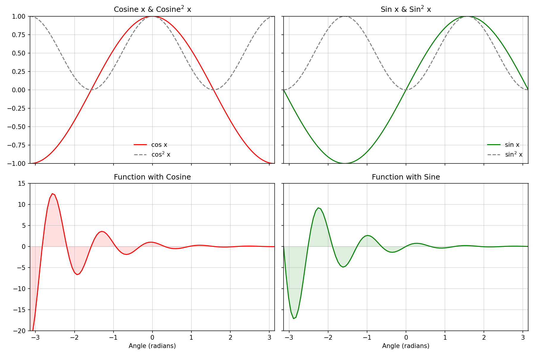
Code
from matplotlib import pyplot as plt
import numpy as np

#--------- Generate cosine and sine values --------#
x = np.linspace(-np.pi, np.pi, num=100, endpoint=True)
cos_x = np.cos(x)
sin_x = np.sin(x)
fun_cos_x = np.exp(-x)*np.cos(5*x)
fun_sin_x = np.exp(-x)*np.sin(5*x)

#------------------ Plot the data -----------------#
fig, axes = plt.subplots(nrows=2, ncols=2, figsize=(12, 8), sharex='col', sharey='row')

# Plot 0,0 : Cosines
axes[0, 0].plot(x, cos_x, color='r', label='cos x')
axes[0, 0].plot(x, cos_x**2, color='grey', linestyle='--', label='cos$^2$ x')
axes[0, 0].set_title('Cosine x & Cosine$^2$ x')
axes[0, 0].set_xlim(-np.pi, np.pi)
axes[0, 0].legend(loc='lower center', frameon=False)

# Plot 0,1 : Sine
axes[0, 1].plot(x, sin_x, color='g', label='sin x')
axes[0, 1].plot(x, sin_x**2, color='grey', linestyle='--', label='sin$^2$ x')
axes[0, 1].set_title('Sin x & Sin$^2$ x')
axes[0, 1].set_ylim(-1.25, 1.25)
axes[0, 1].legend(loc='lower right', frameon=False)

# Plot 1,0 : Function with Cosine
axes[1, 0].plot(x, fun_cos_x, color='r')
axes[1, 0].fill_between(x, fun_cos_x, 0, color='r', alpha=.125)
axes[1, 0].set_title('Function with Cosine')
axes[1, 0].set_xlim(-np.pi, np.pi)

# Plot 0,1 : Function with Sine
axes[1, 1].plot(x, fun_sin_x, color='g')
axes[1, 1].fill_between(x, fun_sin_x, 0, color='g', alpha=.125)
axes[1, 1].set_title('Function with Sine')
axes[1, 1].set_xlim(-np.pi, np.pi)


axes[1, 0].set_xlabel('Angle (radians)')
axes[1, 1].set_xlabel('Angle (radians)')

axes[0, 0].set_ylim(-1, 1)
axes[0, 1].set_ylim(-1, 1)

axes[1, 0].set_ylim(-20, 15)
axes[1, 1].set_ylim(-20, 15)

for a in axes.flat:        # 'flat', 'opens' the 2D list into a simple 1D list
    a.grid(alpha=.5)
    a.set_xlim(-np.pi, np.pi)

plt.tight_layout()
plt.show()
Exercise 2 A Grid Exercise
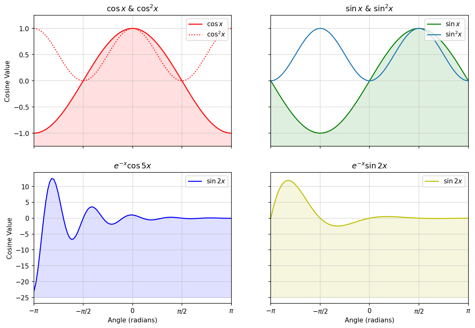
Tasks
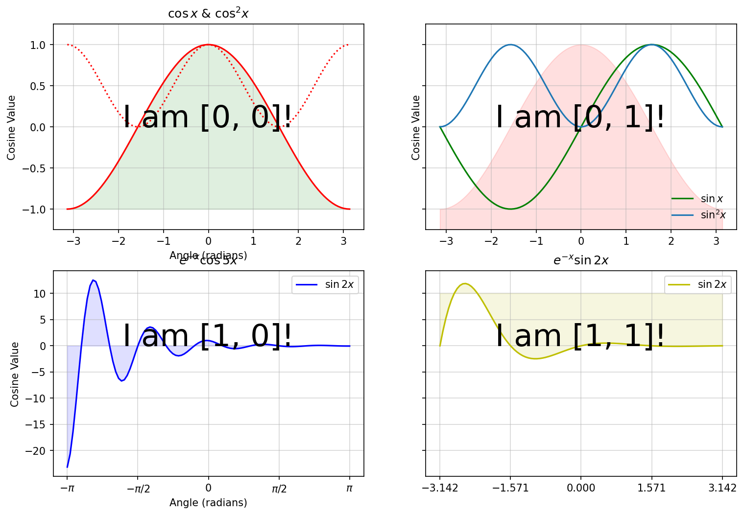
If you compare the image above with the one in the Results tab, you will notice some glaring (and also some subtle) differences. Your task is to modify the code below so that the resulting plot looks like the one in the Results tab.
Here are some things to get you started:
- Remove the text ‘I am..’
- Change the colours used for filling.
- Change the limits of the filled areas.
- Add titles to each subplot.
- Share the x axis across columns.
- Add/Remove labels to the x-axis.
- Make the tick labels of the two bottom plots the same.
- Add grids to all subplots.
- Add a legends to all subplots in the upper right position.
- Try to figure out what plt.tight_layout() does.
import numpy as np
from matplotlib import pyplot as plt

#--------- Generate cosine and sine values --------#
x = np.linspace(-np.pi, np.pi, num=100, endpoint=True)
cos_x = np.cos(x)
sin_x = np.sin(x)
fun1_x = np.exp(-x) * np.cos(5 * x)
fun2_x = np.exp(-x) * np.sin(2 * x)

#------- Plot the data -------#
fig, axes = plt.subplots(nrows=2, ncols=2,
                         figsize=(12, 8),  sharey='row')

#------- Subplot 1 -------#
axes[0, 0].plot(x, cos_x, color='r', label='$\cos x$')
axes[0, 0].plot(x, cos_x**2, color='r',
                linestyle=':', label='$\cos^2 x$')
axes[0, 0].set_title('$\cos x$ & $\cos^2x$')
axes[0, 0].set_ylabel('Cosine Value')
axes[0, 0].fill_between(x, cos_x, -1, color='g', alpha=.125)
axes[0, 0].set_xlabel('Angle (radians)')
axes[0, 0].text(0, 0, 'I am [0, 0]!', fontsize=30,
                horizontalalignment='center')

#------- Subplot 2 -------#
axes[0, 1].plot(x, sin_x, color='g', label='$\sin x$')
axes[0, 1].fill_between(x, cos_x, -2, color='r', alpha=.125)
axes[0, 1].plot(x, sin_x**2, label='$\sin^2 x$')
axes[0, 1].set_ylabel('Cosine Value')
axes[0, 1].set_ylim(-1.25, 1.25)
axes[0, 1].legend(loc='lower right', frameon=False)
axes[0, 1].text(0, 0, 'I am [0, 1]!', fontsize=30,
                horizontalalignment='center')

#------- Subplot 3 -------#
axes[1, 0].plot(x, fun1_x, color='b', label='$\sin 2x$')
axes[1, 0].fill_between(x, fun1_x, 0, color='b', alpha=.125)
axes[1, 0].set_title('$e^{-x}\cos 5x$')
axes[1, 0].set_xlabel('Angle (radians)')
axes[1, 0].set_ylabel('Cosine Value')
axes[1, 0].set_xticks([-np.pi, -np.pi / 2, 0, np.pi / 2, np.pi])
axes[1, 0].set_xticklabels(['$-\pi$', '$-\pi/2$', '0', '$\pi/2$', '$\pi$'])
axes[1, 0].legend()
axes[1, 0].text(0, 0, 'I am [1, 0]!', fontsize=30,
                horizontalalignment='center')

#------- Subplot 4 -------#
axes[1, 1].plot(x, fun2_x, color='y', label='$\sin 2x$')
axes[1, 1].set_title('$e^{-x}\sin 2x$')
axes[1, 1].fill_between(x, fun2_x, 10, color='y', alpha=.125)
axes[1, 1].set_xticks([-np.pi, -np.pi / 2, 0, np.pi / 2, np.pi])
axes[1, 1].legend()
axes[1, 1].text(0, 0, 'I am [1, 1]!', fontsize=30,
                horizontalalignment='center')

 # 'flat', 'opens' the 2D list into a simple 1D list
for a in axes.flat:
    a.grid(alpha=.5)

# plt.tight_layout()
plt.show()
Solution
import numpy as np
from matplotlib import pyplot as plt

#--------- Generate cosine and sine values --------#
x = np.linspace(-np.pi, np.pi, num=100, endpoint=True)
cos_x = np.cos(x)
sin_x = np.sin(x)
fun1_x = np.exp(-x) * np.cos(5 * x)
fun2_x = np.exp(-x) * np.sin(2 * x)

#------- Plot the data -------#
fig, axes = plt.subplots(nrows=2, ncols=2, figsize=(
    12, 8), sharex='col', sharey='row')

#------- Subplot 1 -------#
axes[0, 0].plot(x, cos_x, color='r', label='$\cos x$')
axes[0, 0].plot(x, cos_x**2, color='r', linestyle=':', label='$\cos^2 x$')
axes[0, 0].set_title('$\cos x$ & $\cos^2x$')
axes[0, 0].set_ylabel('Cosine Value')
axes[0, 0].fill_between(x, cos_x, -2, color='r', alpha=.125)

#------- Subplot 2 -------#
axes[0, 1].plot(x, sin_x, color='g', label='$\sin x$')
axes[0, 1].set_title('$\sin x$ & $\sin^2x$')
axes[0, 1].fill_between(x, sin_x, -2, color='g', alpha=.125)
axes[0, 1].plot(x, sin_x**2, label='$\sin^2 x$')
axes[0, 1].set_ylim(-1.25, 1.25)
axes[0, 1].legend(loc='lower right', frameon=False)
axes[0, 1].grid()

#------- Subplot 3 -------#
axes[1, 0].plot(x, fun1_x, color='b', label='$\sin 2x$')
axes[1, 0].fill_between(x, fun1_x, -25, color='b', alpha=.125)
axes[1, 0].set_title('$e^{-x}\cos 5x$')
axes[1, 0].set_xlabel('Angle (radians)')
axes[1, 0].set_ylabel('Cosine Value')
axes[1, 0].set_xticks([-np.pi, -np.pi / 2, 0, np.pi / 2, np.pi])
axes[1, 0].set_xticklabels(['$-\pi$', '$-\pi/2$', '0', '$\pi/2$', '$\pi$'])
axes[1, 0].legend()

#------- Subplot 4 -------#
axes[1, 1].plot(x, fun2_x, color='y', label='$\sin 2x$')
axes[1, 1].set_title('$e^{-x}\sin 2x$')
axes[1, 1].fill_between(x, fun2_x, -25, color='y', alpha=.125)
axes[1, 1].set_xlabel('Angle (radians)')
axes[1, 1].set_xticks([-np.pi, -np.pi / 2, 0, np.pi / 2, np.pi])
axes[1, 1].set_xticklabels(['$-\pi$', '$-\pi/2$', '0', '$\pi/2$', '$\pi$'])
axes[1, 1].legend()

# 'flat', 'opens' the 2D list into a simple 1D list
for a in axes.flat:
    a.grid(alpha=.5)
    a.set_xlim(-np.pi, np.pi)
    a.legend(loc='upper right', frameon=True)

plt.tight_layout()
plt.show()
Example 6 One plot - Two Axes
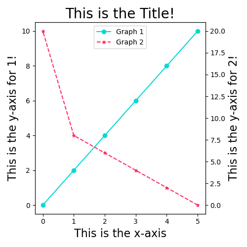
Code
- We generate two sets of data
data_1anddata_2 - Note the use of
marker,linestyle,colorandlabel! - Note that both graphs are plotted on the same figure!
- If you would like a scatterplot with no lines, try
plt.scatter()!
from matplotlib import pyplot as plt

# Some data for plotting
x_1 = [0, 1, 2, 3, 4, 5]
y_1 = [0, 2, 4, 6, 8, 10]

x_2 = [5, 4, 3, 2, 1, 0]
y_2 = [0, 2, 4, 6, 8, 20]


fig, ax1 = plt.subplots(figsize = (5,5))

# Actual plotting #
graph1 = ax1.plot(x_1, y_1, marker = 'o', linestyle = '-',
          color = '#08D9D6', label = 'Graph 1')
ax1.set_xlabel('This is the x-axis', fontsize = 16)
ax1.set_ylabel('This is the y-axis for 1!', fontsize = 16)


ax2 = ax1.twinx()  # Create a new Axes object which uses the same x-axis as ax1


graph2 = ax2.plot(x_2, y_2, marker = '*', markersize='5', linestyle = 'dashed',
          color = '#FF2E63', label = 'Graph 2')
ax2.set_ylabel('This is the y-axis for 2!', fontsize = 16)

graphs = graph1+graph2
graphlabels = [g.get_label() for g in graphs]
plt.legend(graphs,graphlabels,loc=9)

plt.title('This is the Title!', fontsize = 20)
plt.tight_layout()
plt.show()
6.3 Other Plots
Example 7 Histograms
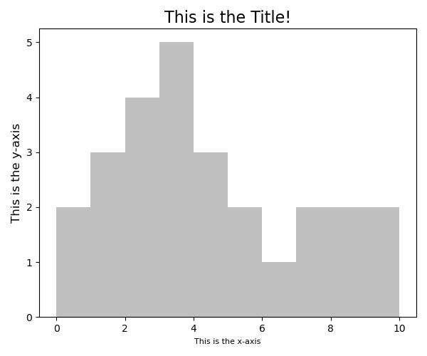
Code
- We generate a set of data that are Continously distributed
- We used
plt.hist()to generate the histogram!
from matplotlib import pyplot as plt

# Some data for plotting
data = [0,0,1,1,1,2,2,2,2,3,3,3,3,3,4,4,4,5,5,6,7,7,8,8,9,10]


# Actual plotting #
plt.hist(data, bins = 10,color='#C0C0C0')

# Aesthetics #
plt.xlabel('This is the x-axis', fontsize =8)
plt.ylabel('This is the y-axis', fontsize = 12)
plt.title('This is the Title!', fontsize = 16)
plt.tight_layout()
plt.show()
Example 8 Boxplots

Code
- We generate a set of data that are Normally distributed
- We used
plt.boxplot()to generate the boxplot! - Here we used another package,numpy to create a separate array
from matplotlib import pyplot as plt
import numpy as np


# Some data for plotting
data = [0,0,1,1,1,2,2,2,2,3,3,3,3,3,4,4,4,5,5,6,7,7,8,8,9,10]
data1 = np.array(data) / 1.5 * 5
print(data1)


# Actual plotting #
plt.boxplot([data, data1], labels = ['data','data1'])


# Aesthetics #
plt.xlabel('This is the x-axis', fontsize = 16)
plt.ylabel('This is the y-axis', fontsize = 16)
plt.title('This is the Title!', fontsize = 20)
plt.tight_layout()
plt.show()